Visualizing Crystal Poles in the Pole Density Function#
In this tutorial we will quantify the distribution of crystallographic poles, which is useful, for example, in texture analysis, using the Pole Distribution Function (PDF).
[1]:
%matplotlib inline
import numpy as np
from matplotlib import pyplot as plt
from mpl_toolkits.mplot3d import Axes3D
from orix import plot
from orix.crystal_map import Phase
from orix.data import ti_orientations
from orix.sampling import sample_S2
from orix.vector import Miller, Vector3d

# We'll want our plots to look a bit larger than the default size
plt.rcParams.update(
    {
        "figure.figsize": (10, 5),
        "lines.markersize": 2,
        "font.size": 15,
        "axes.grid": False,
    }
)
w, h = plt.rcParams["figure.figsize"]
/home/docs/checkouts/readthedocs.org/user_builds/orix/conda/stable/lib/python3.11/site-packages/tqdm/auto.py:21: TqdmWarning: IProgress not found. Please update jupyter and ipywidgets. See https://ipywidgets.readthedocs.io/en/stable/user_install.html
  from .autonotebook import tqdm as notebook_tqdm
First, we load some sample orientations from a Titanium sample dataset which represent crystal orientations in the sample reference frame. These orientations have a defined \(622\) point group symmetry:
Note
If not previously downloaded, running this cell will download some example data from an online repository to a local cache, see the docstring of ti_orientations() for more details.
[2]:
O = ti_orientations(allow_download=True)
O
[2]:
Orientation (193167,) 622
[[ 0.3027  0.0869 -0.5083  0.8015]
 [ 0.3088  0.0868 -0.5016  0.8034]
 [ 0.3057  0.0818 -0.4995  0.8065]
 ...
 [ 0.4925 -0.1633 -0.668   0.5334]
 [ 0.4946 -0.1592 -0.6696  0.5307]
 [ 0.4946 -0.1592 -0.6696  0.5307]]
Let’s look at the sample’s \(\{01\bar{1}1\}\) texture plotted in the stereographic projection.
First we must define the crystal’s point group and generate the set of symmetrically unique \((01\bar{1}1)\) poles:
[3]:
[3]:
Miller (12,), point group 622, hkil
[[ 0.  1. -1.  1.]
 [-1. -0.  1.  1.]
 [ 1. -1.  0.  1.]
 [ 0. -1.  1.  1.]
 [ 1.  0. -1.  1.]
 [-1.  1. -0.  1.]
 [ 0. -1.  1. -1.]
 [ 1.  0. -1. -1.]
 [-1.  1. -0. -1.]
 [ 0.  1. -1. -1.]
 [-1. -0.  1. -1.]
 [ 1. -1.  0. -1.]]
Now let’s compute the direction of these poles in the sample reference frame.
This is done using the Orientation-Vector3d outer product. We can pass lazy=True parameter to perform the computation in chunks using Dask, this helps to reduce memory usage when there are many computations to be performed.
[4]:
poles = O.inv().outer(g, lazy=True, progressbar=True, chunk_size=2000)
poles.shape
[########################################] | 100% Completed | 9.16 s
[4]:
(193167, 12)
We can plot these poles in the sterographic projection:
[5]:
poles.scatter(
    hemisphere="both",
    alpha=0.02,
    figure_kwargs={"figsize": (2 * h, h)},
    axes_labels=["X", "Y"],
)
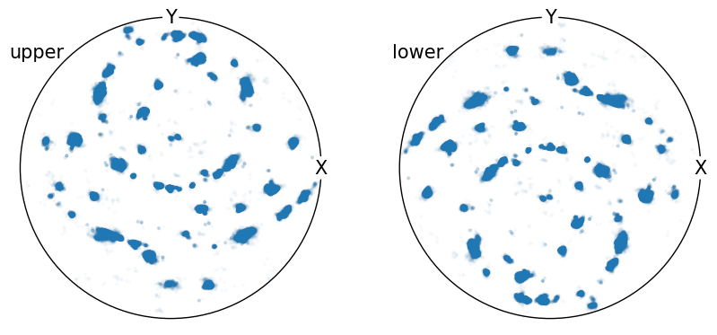
In this case there are many individual data points, which makes it difficult to interpret whether regions contain higher or lower pole density.
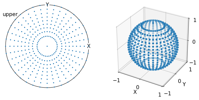
In this case we can use the Vector3d.pole_density_function() to measure the pole density on the unit sphere \(S_2\). Internally this uses the equal area parameterization to calculate cells on \(S_2\) with the same solid angle. In this representation randomly oriented vectors have the same probability of intercepting each cell, thus we can represent our sample’s PDF as Multiples of Random Density (MRD). This follows the work of [Rohrer et al., 2004].
Below is the equal area sampling representation on \(S_2\) in both the stereographic projection and 3D with a resolution of 10°:
[6]:
fig = plt.figure(figsize=(2 * h, h))
ax0 = fig.add_subplot(121, projection="stereographic", hemisphere="upper")
ax1 = fig.add_subplot(122, projection="3d")

v_mesh = sample_S2(resolution=10, method="equal_area")

ax0.scatter(v_mesh)
ax0.set_labels("X", "Y", None)
ax0.show_hemisphere_label()

ax1.scatter(*v_mesh.data.T)

lim = 1
ax1.set(
    xlim=(-lim, lim),
    ylim=(-lim, lim),
    zlim=(-lim, lim),
    xticks=(-lim, 0, lim),
    yticks=(-lim, 0, lim),
    zticks=(-lim, 0, lim),
    xlabel="X",
    ylabel="Y",
    zlabel="Z",
    box_aspect=(1, 1, 1),
);
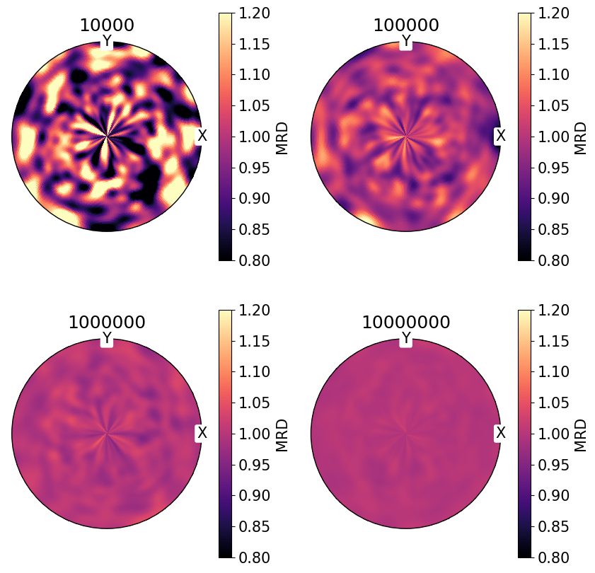
For randomly distributed vectors on \(S_2\), we can can see that MRD tends to 1 with an increasing number of vectors:
NB. PDF plots are displayed on the same color scale.
[7]:
num = (10_000, 100_000, 1_000_000, 10_000_000)

fig, ax = plt.subplots(
    nrows=2,
    ncols=2,
    figsize=(2 * h, 2 * h),
    subplot_kw={"projection": "stereographic"},
)
ax = ax.ravel()

for i, n in enumerate(num):
    v = Vector3d.random(n)
    ax[i].pole_density_function(v, log=False, vmin=0.8, vmax=1.2)
    ax[i].set_labels("X", "Y", None)
    ax[i].set(title=str(n))
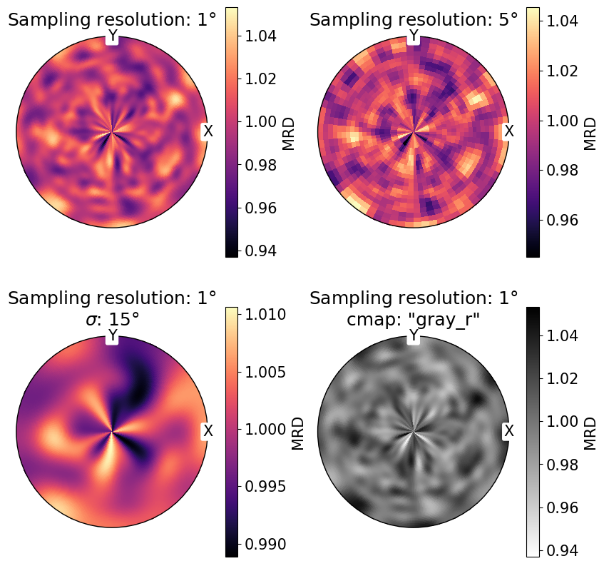
We can also change the sampling angular resolution on \(S_2\), the colormap with the cmap parameter, and broadening of the density distribution with sigma:
[8]:
fig, ax = plt.subplots(
    nrows=2,
    ncols=2,
    figsize=(2 * h, 2 * h),
    subplot_kw={"projection": "stereographic"},
)
ax = ax.ravel()

v = Vector3d.random(1_000_000)

ax[0].pole_density_function(v, log=False, resolution=1)
ax[0].set(title=r"Sampling resolution: 1$\degree$")

# change sampling resolution on S2
ax[1].pole_density_function(v, log=False, resolution=5)
ax[1].set(title=r"Sampling resolution: 5$\degree$")

# increase peak broadening
ax[2].pole_density_function(v, log=False, resolution=1, sigma=15)
ax[2].set(title="Sampling resolution: 1$\\degree$\n$\\sigma$: 15$\\degree$")

# change colormap
ax[3].pole_density_function(v, log=False, resolution=1, cmap="gray_r")
ax[3].set(title="Sampling resolution: 1$\\degree$\ncmap: 'gray_r'")

for a in ax:
    a.set_labels("X", "Y", None)
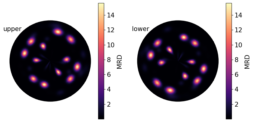
Poles from real samples tend not to be randomly oriented, as the material microstructure is arranged into regions of similar crystal orientation, known as grains.
The PDF for the measured \(\{01\bar{1}1\}\) poles from the Titanium sample loaded at the beginning of the tutorial:
[9]:
poles.pole_density_function(
    hemisphere="both", log=False, figure_kwargs={"figsize": (2 * h, h)}
)
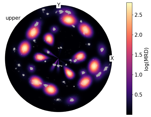
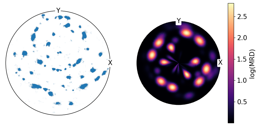
We can also plot these densities on a log scale to reduce the contrast between high and low density regions.
By comparing the point data shown at the top of the notebook with the calculated pole densities from PDF, we can see that not all regions in the point data representation have the same density and that PDF is needed for better quantification:
[10]:
fig, ax = plt.subplots(
    ncols=2,
    subplot_kw={"projection": "stereographic", "hemisphere": "upper"},
    figsize=(2 * h, h),
)

ax[0].scatter(poles, s=2, alpha=0.02)
ax[1].pole_density_function(poles, log=True)

for a in ax:
    a.set_labels("X", "Y", None)
A clear example of this can be shown by combining the PDF and point data onto the same plot:
[11]:
fig = poles.scatter(
    alpha=0.01,
    c="w",
    return_figure=True,
    axes_labels=["X", "Y"],
    show_hemisphere_label=True,
)
poles.pole_density_function(log=True, figure=fig)